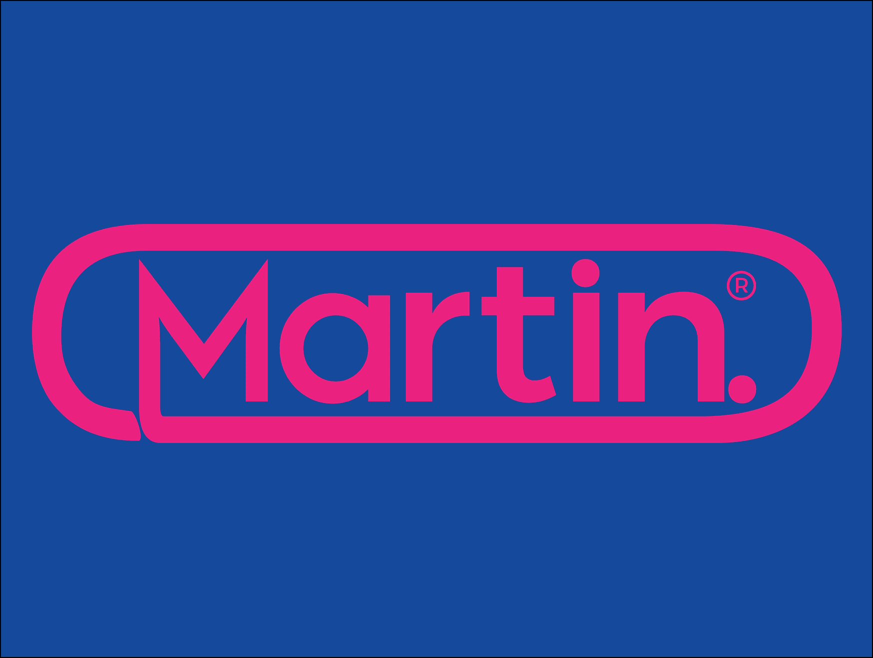
A pill-shaped, bubblegum-pink-and-cobalt identity designed for Marti Hoyos’ upcoming release—an ironic, hyper-digital take on nostalgia and the “prescription” for life chronically online.

YEAR
2025
ROLE
Creative Director
Graphic Designer
SERVICES
Art Direction
Logo Design
SOFTWARE
Figma
Photoshop
About the project
For this project, I created a custom visual identity and logomark for musician Marti Hoyos to support an upcoming music release. Inspired by the aesthetics of Benadryl packaging and the hyper-digital world we’re all steeped in, the identity blends playful nostalgia with a sleek, contemporary edge.
I explored one of my favorite color pairings—bubblegum pink and cobalt blue—to create a palette that feels vibrant, addictive, and distinctly online. The design leans into the pill–inspired motif, reimagined as a polished visual metaphor for the “prescription” we all seek in our chronically-online culture.
The result is a bold, instantly recognizable identity that feels both ironic and intentional, matching the energy, humor, and personality of Marti’s sound.


The development of this hyper-pop pink identity began with Marti’s desire to move away from the typical visual language associated with heartbreak. In early conversations, he described the emotional aftermath of his breakup—feeling physically ill, overstimulated, and numb in waves. Instead of leaning into the dark reds, browns, and clichéd “sadness palettes” that often symbolize this experience, I wanted to reinterpret heartbreak through a lens that felt contemporary, unexpected, and more reflective of how our generation metabolizes emotion. The idea of self-medicating became a natural conceptual anchor—not in a literal sense, but as a metaphor for the ways we soothe ourselves, cope, and try to regain a sense of control. Rather than emphasizing heaviness or pain, I pulled inspiration from the bright, almost comforting familiarity of over-the-counter packaging. There’s something striking about the simplicity and eye-searing colors of products like Benadryl: they’re approachable, recognizable, and strangely reassuring. By channeling that aesthetic into a hyper-pop pink logo system, I aimed to transform a difficult emotional state into something bold, accessible, and culturally relevant—an identity that mirrors both the chaos and the candy-coated resilience of being young, heartbroken, and trying to heal.


To finalize the project, I developed a complete set of logo and brand guidelines outlining usage, sizing, and best practices to ensure the identity remained consistent across Marti’s music release. I also designed a collection of custom merchandise and promotional posters inspired by his aesthetic direction, giving the project a fully realized visual ecosystem. The result is a cohesive, ready-to-use brand package that supports Marti’s new era from digital release to physical merch—and provides a clear roadmap for future creative expansion.

Smooth Scroll
This will hide itself!
This will hide itself!
Martin.
OVERVIEW
A pill-shaped, bubblegum-pink-and-cobalt identity designed for Marti Hoyos’ upcoming release—an ironic, hyper-digital take on nostalgia and the “prescription” for life chronically online.
YEAR
2025
ROLE
Creative Director
Graphic Designer
SERVICES
Art Direction
Logo Design
SOFTWARE
Figma
Photoshop
About the project
For this project, I created a custom visual identity and logomark for musician Marti Hoyos to support an upcoming music release. Inspired by the aesthetics of Benadryl packaging and the hyper-digital world we’re all steeped in, the identity blends playful nostalgia with a sleek, contemporary edge.
I explored one of my favorite color pairings—bubblegum pink and cobalt blue—to create a palette that feels vibrant, addictive, and distinctly online. The design leans into the pill–inspired motif, reimagined as a polished visual metaphor for the “prescription” we all seek in our chronically-online culture.
The result is a bold, instantly recognizable identity that feels both ironic and intentional, matching the energy, humor, and personality of Marti’s sound.
The development of this hyper-pop pink identity began with Marti’s desire to move away from the typical visual language associated with heartbreak. In early conversations, he described the emotional aftermath of his breakup—feeling physically ill, overstimulated, and numb in waves. Instead of leaning into the dark reds, browns, and clichéd “sadness palettes” that often symbolize this experience, I wanted to reinterpret heartbreak through a lens that felt contemporary, unexpected, and more reflective of how our generation metabolizes emotion. The idea of self-medicating became a natural conceptual anchor—not in a literal sense, but as a metaphor for the ways we soothe ourselves, cope, and try to regain a sense of control. Rather than emphasizing heaviness or pain, I pulled inspiration from the bright, almost comforting familiarity of over-the-counter packaging. There’s something striking about the simplicity and eye-searing colors of products like Benadryl: they’re approachable, recognizable, and strangely reassuring. By channeling that aesthetic into a hyper-pop pink logo system, I aimed to transform a difficult emotional state into something bold, accessible, and culturally relevant—an identity that mirrors both the chaos and the candy-coated resilience of being young, heartbroken, and trying to heal.
To finalize the project, I developed a complete set of logo and brand guidelines outlining usage, sizing, and best practices to ensure the identity remained consistent across Marti’s music release. I also designed a collection of custom merchandise and promotional posters inspired by his aesthetic direction, giving the project a fully realized visual ecosystem. The result is a cohesive, ready-to-use brand package that supports Marti’s new era from digital release to physical merch—and provides a clear roadmap for future creative expansion.
Smooth Scroll
This will hide itself!
This will hide itself!